01A / PRIMARY WORDMARKLIGHT
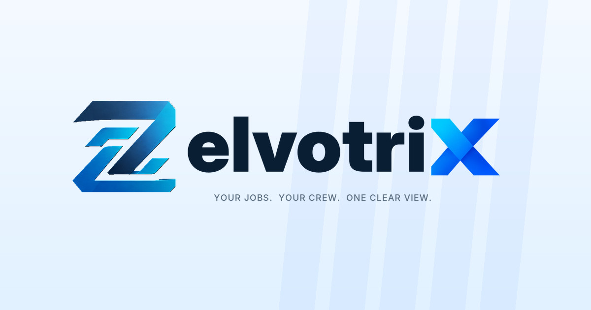
Light-background lockup
PNG Websites, documents and presentations

ZelvotriX brings jobs, people and operations together. Explore the brand system behind our distinctive custom Z, modern blue X and straightforward promise to service businesses.
Your jobs. Your crew. One clear view.
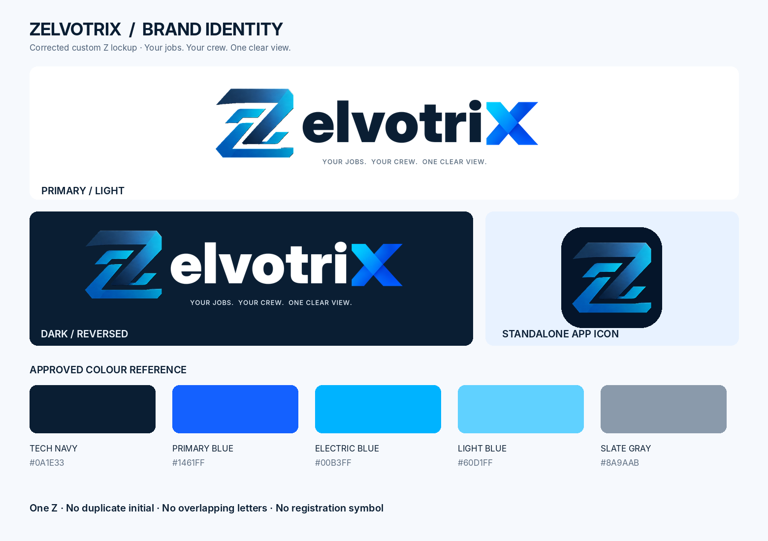
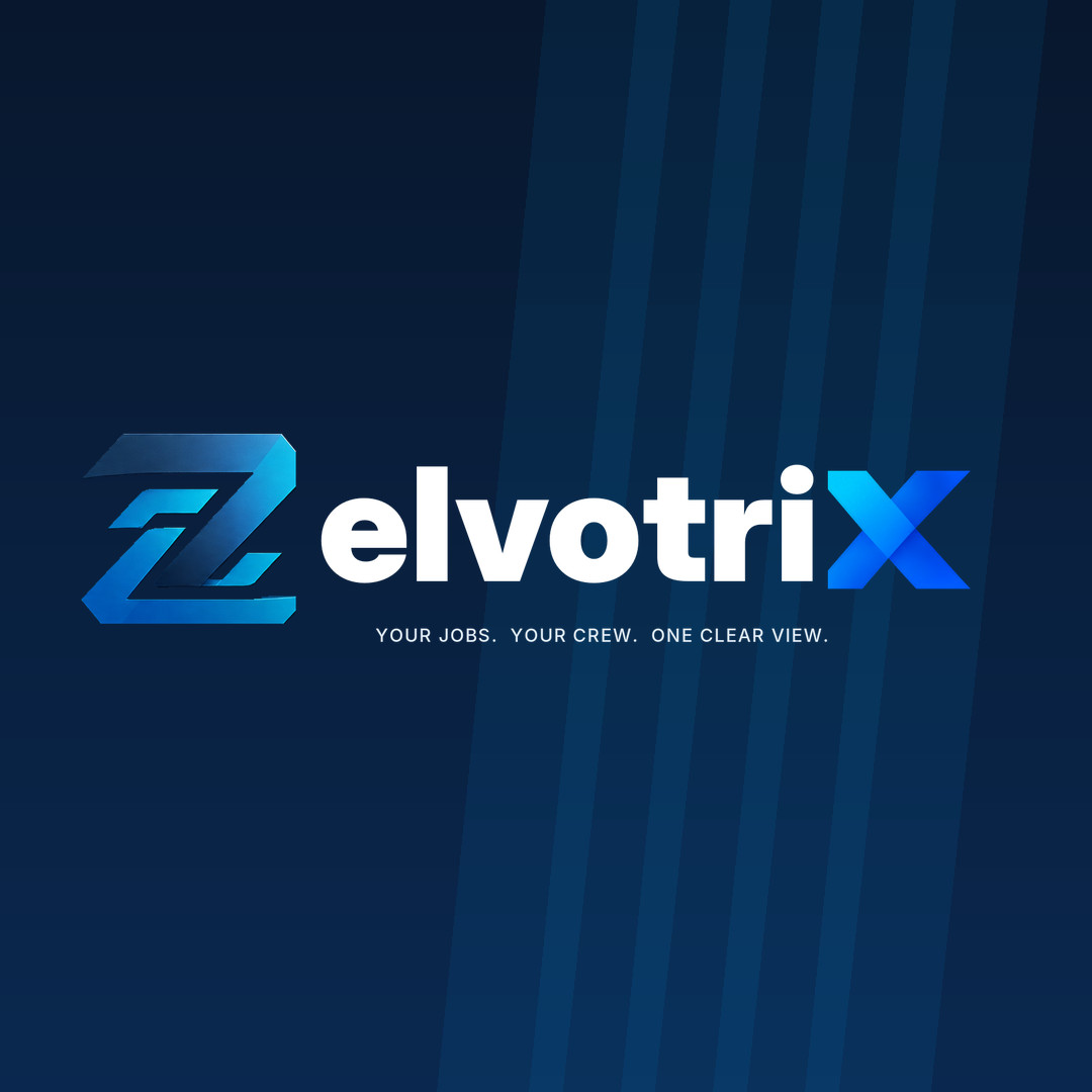
The custom Z is the first letter of ZelvotriX. It is not a separate emblem followed by another Z. Both colour variants use the same integrated silhouette and consistent spacing.
Websites, documents and presentations
Headers, platform UI and dark advertising
Preserve the approved Z geometry, its cut-outs and gradient direction. Keep the final X bright blue, the remaining lettering navy or white, and the wordmark free of trademark or registration symbols.
Our layered angular Z combines a strong horizontal silhouette, three-dimensional blue tones and distinctive negative space. The mark should never be replaced by a generic letter Z.
 Gradient • geometry • recognition
 Made for screens and shortcuts
Colour is intentional: navy conveys stability; blue and cyan bring momentum and clarity. Use these as identity reference colours, and check actual foreground/background combinations for accessible contrast.
Primary dark surfaces, brand contrast
Accent, call to action, Z gradient
Digital highlights and X treatment
Secondary highlight tone
Supporting UI and neutral accents
Keep the same logo proportions, clear space and tagline across every customer touchpoint. These rules help the approved design survive at different sizes and on different backgrounds.
Keep a minimum clear area equal to the height of the blue X on every side. Never allow headlines, borders or other icons to crowd the mark.
Recommended compact width: 200 pxFor the full tagline lockup, prefer 200 px or wider; for smaller placements use the icon alone. Check readability at actual display size.
Use “Your jobs. Your crew. One clear view.” with the original punctuation. Do not substitute the retired “Jobs | People | Profit” line in new collateral.
Use approved files, proportions, palettes and original Z geometry. Choose the correct light or dark contrast version.
Adding another Z, stretching the wordmark, changing its gradient, adding ®, or using a complex background that compromises readability.
Social and preview imagery reinforces recognition without introducing a different logo design. Use these approved layouts as ready-to-download raster assets.
Choose an individual file or get the complete approved raster brand package. Public files are versioned separately from customer and platform data.
Primary and reversed logos, icon sizes, social graphics, source board and visual specifications.
Raster source package • Not an editable vector masterMaster file note. This release originates from approved raster concept artwork, not a native SVG or editable vector file. Logo PNGs retain source pixels and WebP files are optimized for the web. Inspect edge quality at large print sizes before production and commission an exact vector master for professional print applications.
One connected home for field service teams, with a brand that is recognizable at every step.